Design Systems
Creating and establishing design systems in collaboration with designers was a priority throughout 2022 as we focused on growth. Expanding from a small startup to a larger scale company meant that practices needed to be put in place to ensure consistent copy and design throughout the product, as well as across different teams.
Date
Spring 2023
Areas
Content, Design System
See style guide
〰️
See style guide 〰️
When I joined Qapital as the company’s first and only full-time content designer, I led the initiative to build a style guide from scratch in order to govern voice, tone, and style. I found this exercise to be extremely useful, especially due to the fact that Qapital’s design team includes people from all over the world—and many of our designers and developers speak Swedish, Brazilian, or Russian as their primary languages. Some things get lost in translation, so it’s important to have a document that can ensure consistency and clarity across the board.
Content
Style Guide
Voice & Tone
When I joined Qapital as the company’s first and only full-time content designer, I led the initiative to build a style guide from scratch in order to govern voice, tone, and style. I found this exercise to be extremely useful, especially due to the fact that Qapital’s design team includes people from all over the world—and many of our designers and developers speak Swedish, Brazilian, or Russian as their primary languages. Some things get lost in translation, so it’s important to have a document that can ensure consistency and clarity across the board.
Beyond the written style guide, I worked with designers to build our design system of components to enable our product teams to quickly build and scale experiences aligned to our visual and written guidelines.
Qapital’s
Design System
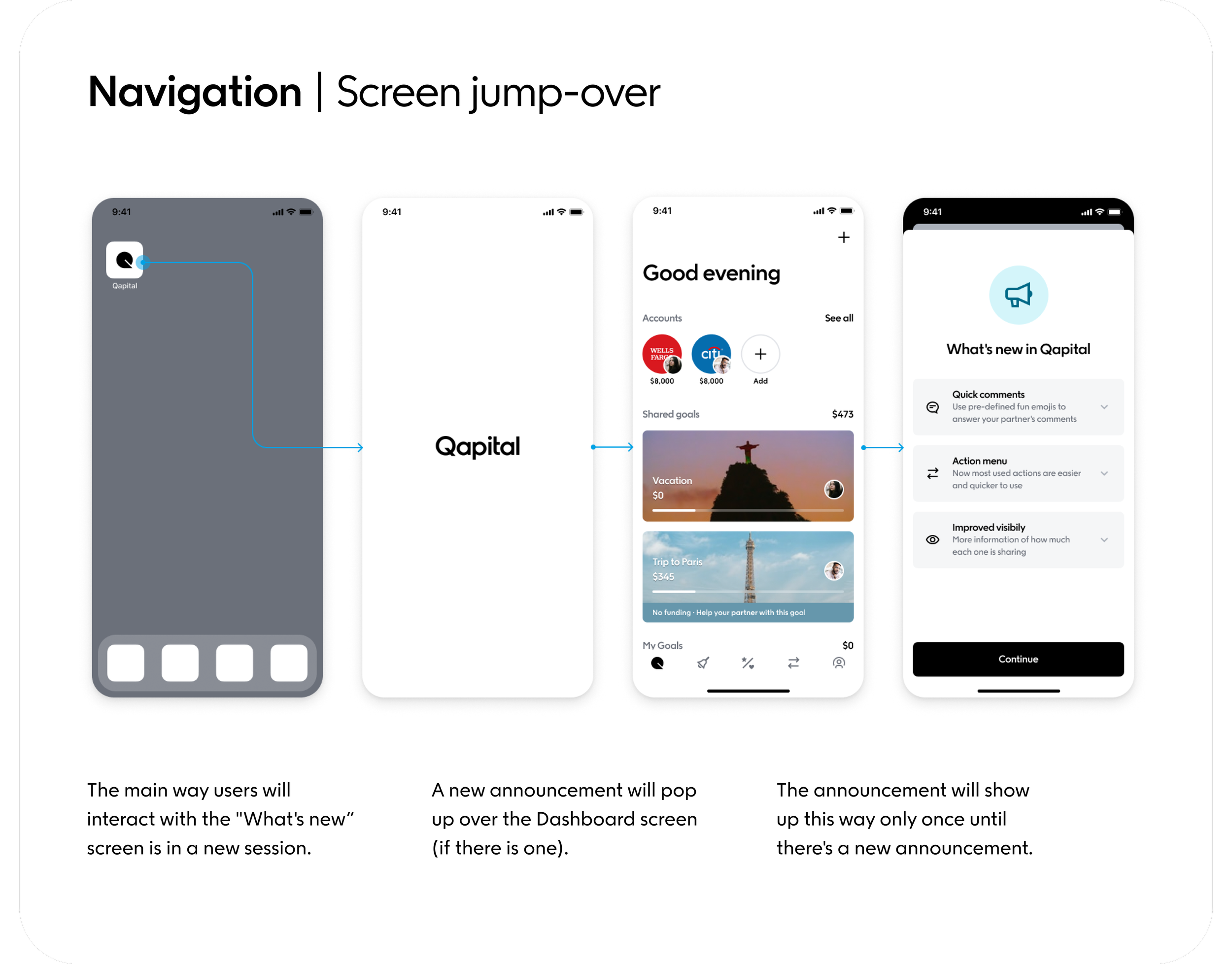
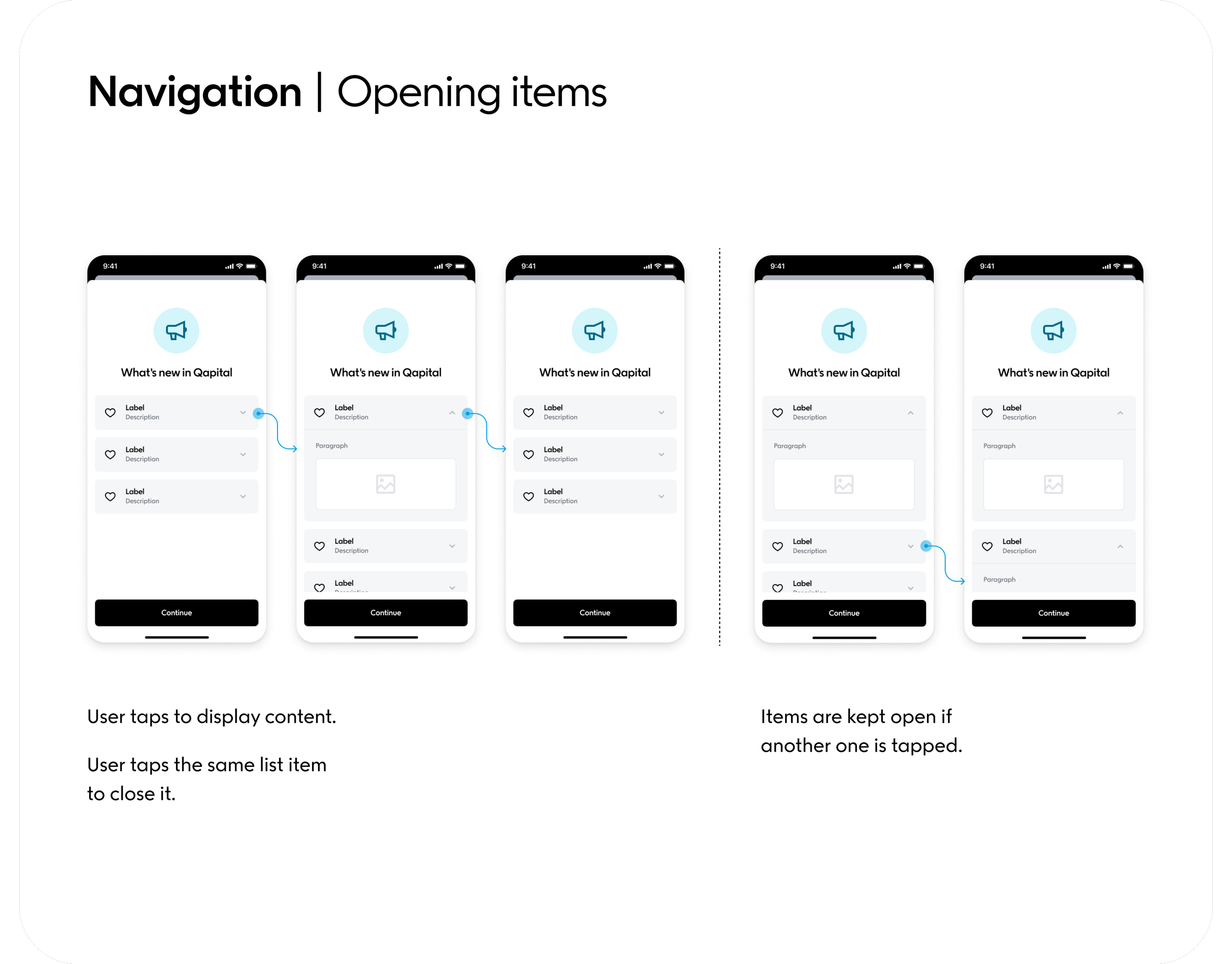
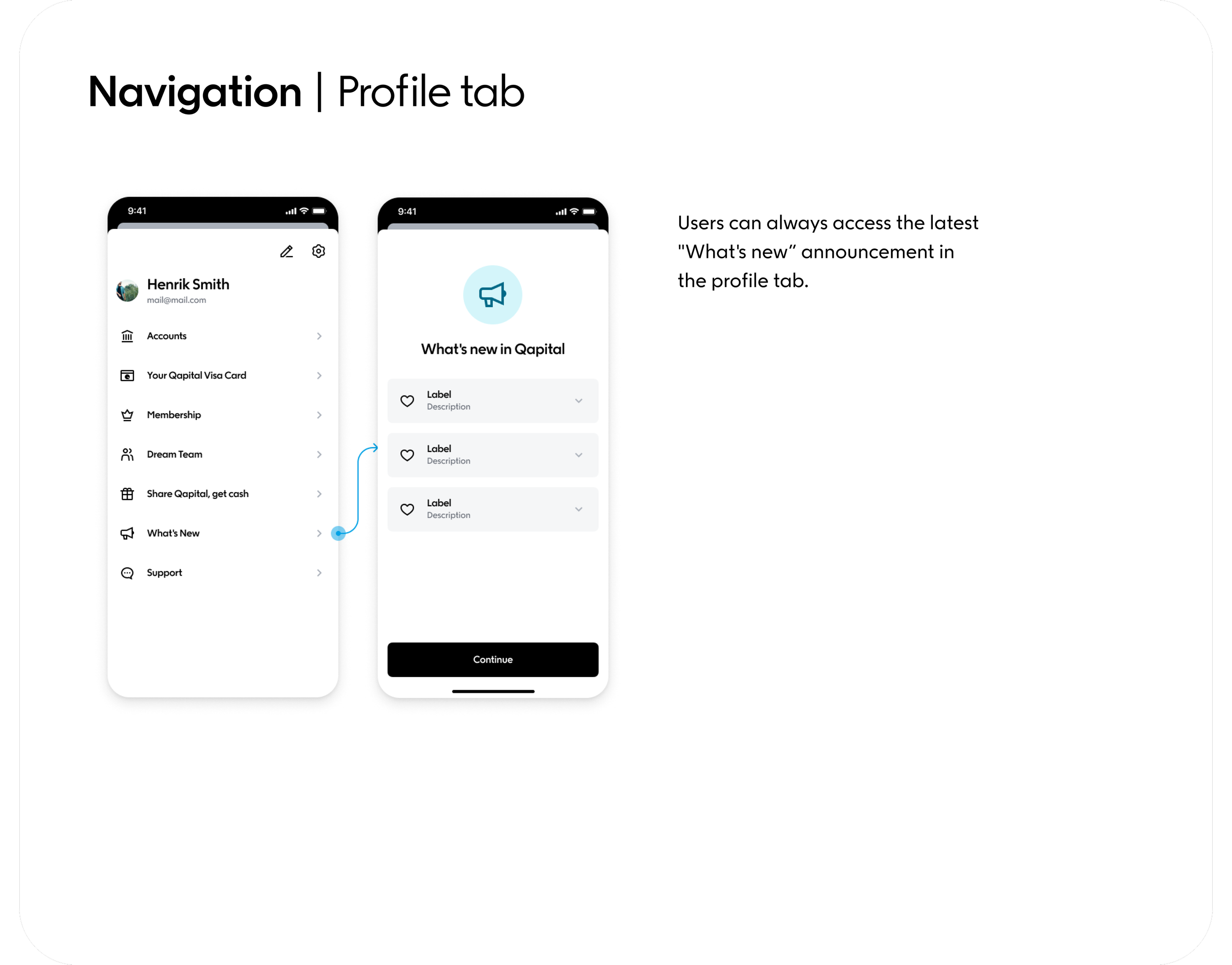
What’s New Announcement Sheet
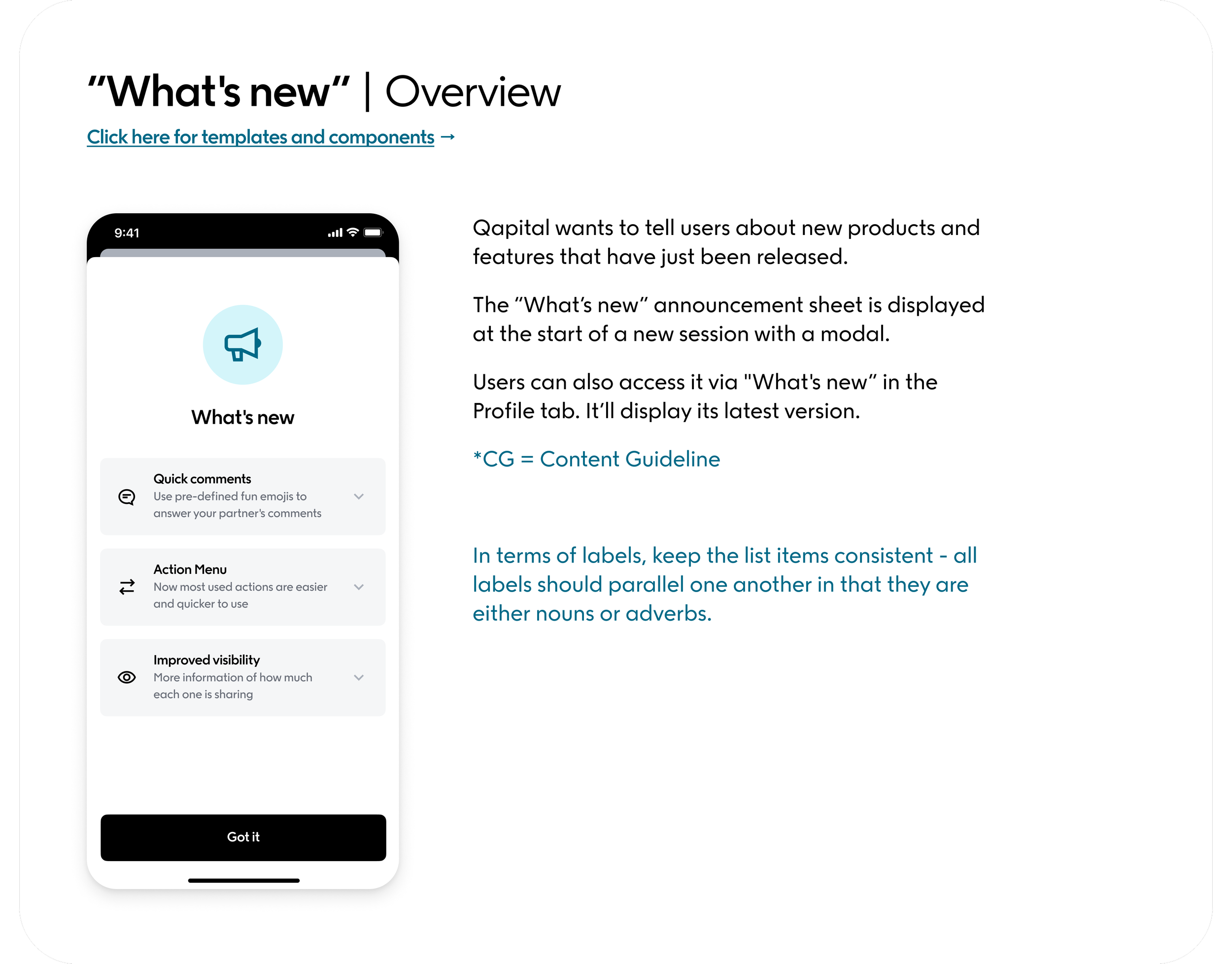
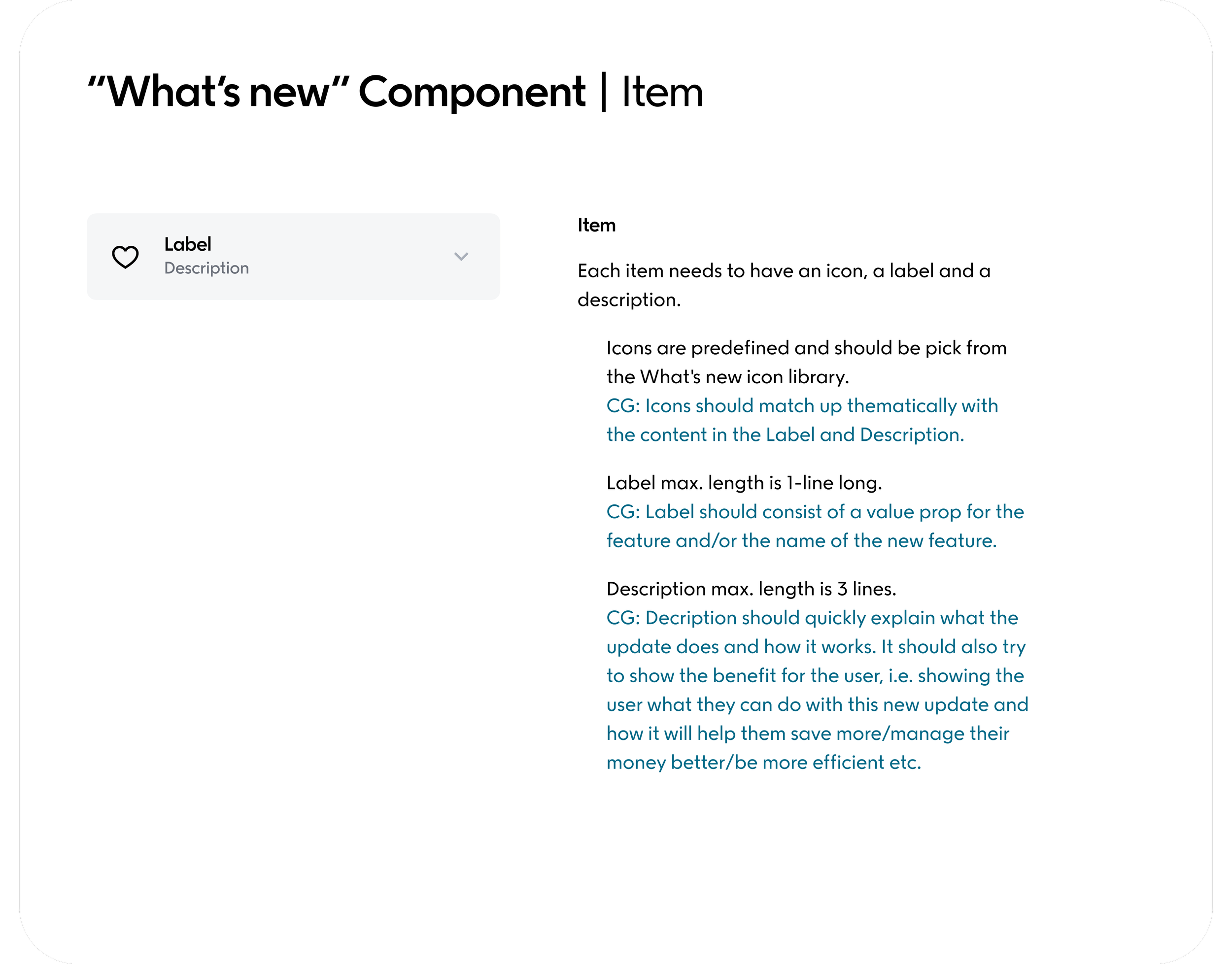
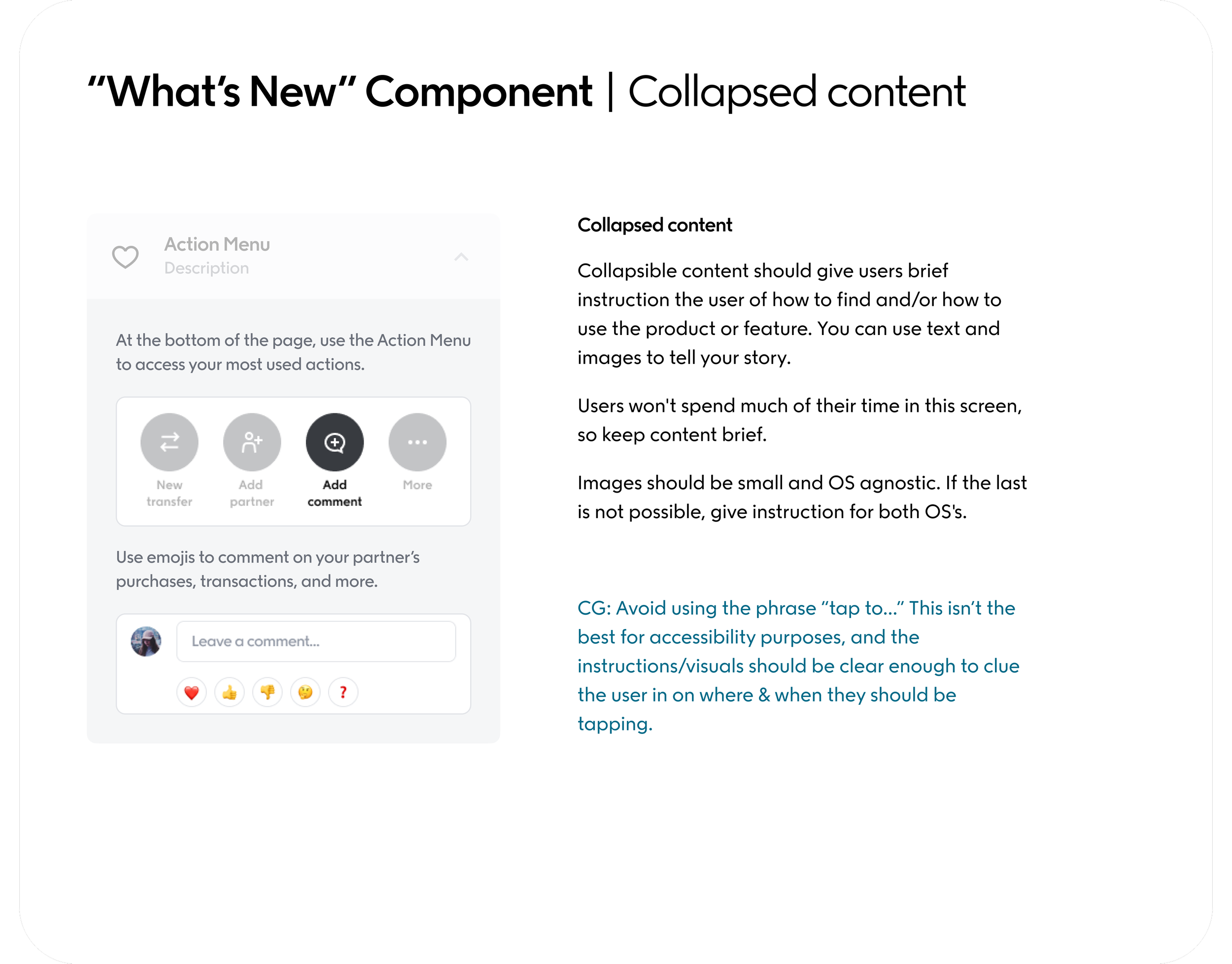
I created content guidelines for a few common app features so that design and content teams in the future could have templates to go off of. Below is an example of one of them—the “What’s new” Announcement Sheet. The aim of these “cheat-sheets” were to solve internal consistency problems and help employees at the company find the right information they needed quickly and easily. Content guidelines are written in blue, to be easily distinguished from design guidelines, which are in the color black.
The “What’s New” modal, below, is used when we want to clue the user in on new updates to Qapital, helping them discover new features or use the app even more efficiently than they could before.
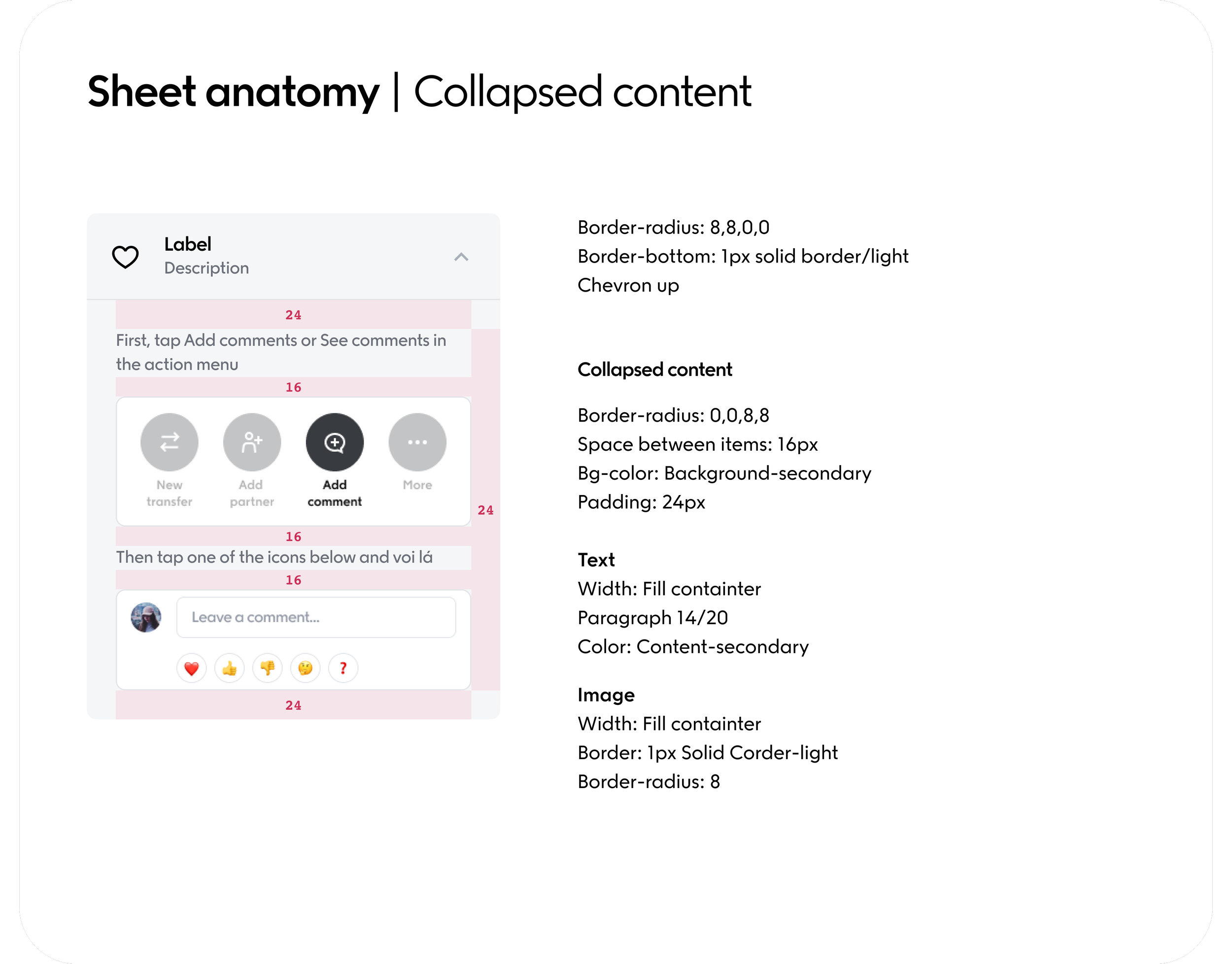
Sheet anatomy
add description


Navigation
add description